AI can turn a short brand description into several logo concepts, but the first generated image is rarely ready to use. A complete logo workflow includes defining the brand, exploring distinct concepts, refining the strongest direction, adding accurate typography, checking for similar marks, and preparing final files.
Here is how to create a logo with AI using XPT.
Step 1: Write a Short Brand Brief
Before thinking about colors or symbols, define what the logo needs to represent.
Write down:
- Brand name.
- Product or service.
- Target audience.
- Three brand qualities.
- Preferred logo type.
- Colors to use or avoid.
- Where the logo will appear.
- Symbols or visual clichés to avoid.
For example:
| Brief Element | Example |
|---|---|
| Brand | Northline |
| Business | Project-management software for remote creative teams |
| Audience | Small agencies and independent studios |
| Personality | Clear, energetic, collaborative |
| Logo type | Icon-only geometric symbol |
| Colors | Deep blue with a coral accent |
| Uses | Website, app icon, social profile, presentations |
| Avoid | Checkmarks, puzzle pieces, chat bubbles, gradients |
A specific brief gives the AI a clear design problem to solve.
Step 2: Generate Several Logo Directions
Open XPT and turn the brief into a prompt.
“Create an icon-only logo for Northline, a project-management platform for remote creative teams. The identity should feel clear, energetic, and collaborative. Build one geometric symbol from three connected forms that suggest alignment and forward movement. Use deep blue with a small coral accent. Keep the design flat, simple, and recognizable at app-icon size. No text, checkmarks, puzzle pieces, chat bubbles, gradients, shadows, or 3D effects.”
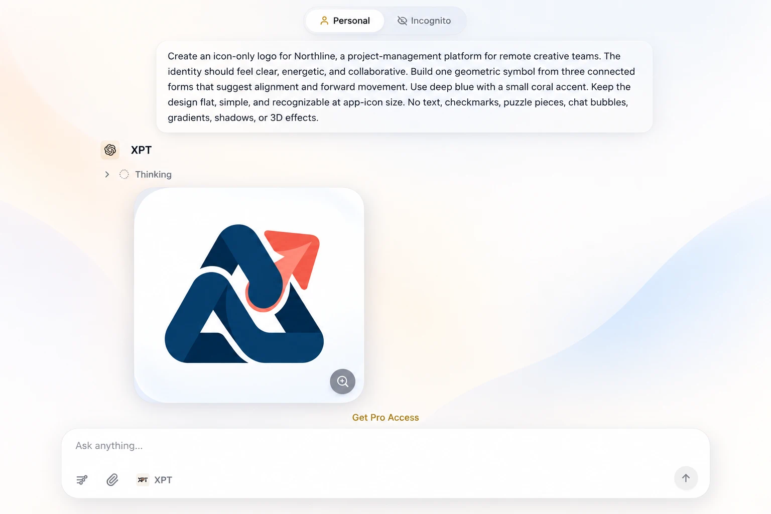
- A geometric direction.
- A negative-space direction.
- An organic direction.
- A bold typographic direction.
- A simple emblem direction.
Do not choose a concept only because it contains more detail. Look for one clear idea that fits the brand.
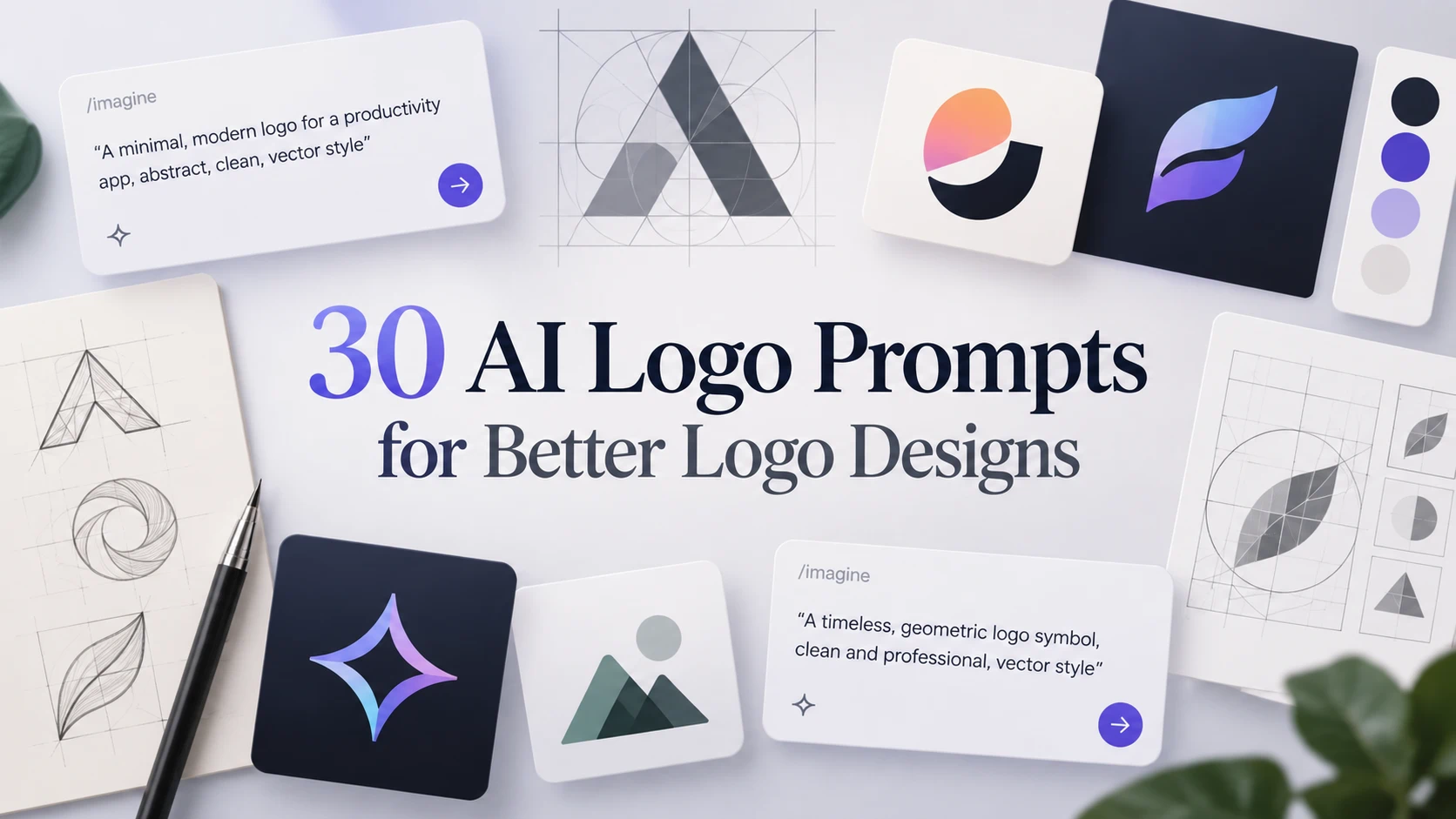
Explore 30 AI logo prompts for better logo designs for ready-to-use examples across technology, fashion, food, professional services, and other industries.
Step 3: Compare the Concepts
Place the strongest options side by side.
Evaluate each one using the same criteria:
| Criterion | Question |
|---|---|
| Brand fit | Does it reflect the right personality? |
| Relevance | Does the idea connect with the business without being too literal? |
| Simplicity | Is there one clear visual concept? |
| Recognition | Can you distinguish it from the other options quickly? |
| Small-size use | Does it remain clear as an app icon or profile image? |
| Versatility | Can it work in color, black, and white? |
Choose one direction to develop. Combining several unrelated concepts usually makes the logo more complicated.
Step 4: Refine the Selected Design
Use follow-up prompts to change one part of the concept at a time.
To simplify the symbol:
“Keep the central concept and overall silhouette. Reduce the design to three solid shapes, remove the small internal details, and make the negative space more visible.”
To improve the color system:
“Keep the symbol unchanged. Use deep navy as the primary color and coral only as a small accent. Also provide a version that works entirely in black.”
To remove presentation effects:
“Convert the selected concept into a flat vector-style logo mark. Remove the mockup, background scene, texture, lighting effects, shadows, bevels, and 3D depth. Present the symbol centered on a plain white background.”
To strengthen small-size legibility:
“Keep the main idea, but use broader shapes, clearer spacing, and stronger contrast. Remove any detail that would disappear at favicon size.”
Continue refining until the logo has a clear silhouette and no unnecessary decoration.
Step 5: Add the Brand Name Separately
AI-generated lettering may contain misspellings, uneven spacing, or inconsistent letterforms.
Generate the symbol without text, then add the exact brand name in a design editor. Choose typography that supports the logo’s personality:
| Brand Direction | Typography Starting Point |
|---|---|
| Modern technology | Clean geometric sans serif |
| Premium or editorial | High-contrast serif |
| Friendly consumer brand | Rounded sans serif |
| Established professional service | Restrained serif or humanist sans serif |
| Bold creative brand | Custom display lettering |
Create several arrangements:
- Symbol above the name.
- Symbol beside the name.
- Wordmark without the symbol.
- Icon-only version.
- Compact version for small spaces.
Adjust the spacing manually instead of accepting the first automatic placement.
Step 6: Test the Logo in Real Situations
A logo that looks good at a large size may fail in actual use.
Test it on:
- A website header.
- A mobile app icon.
- A social media profile.
- A business card.
- Product packaging.
- A monochrome document.
- Light and dark backgrounds.
- A very small browser favicon.
Check whether thin lines disappear, small gaps close up, or colors lose contrast.
The logo should still be recognizable without a presentation mockup surrounding it.
Step 7: Check for Similar Logos
AI can generate a design that resembles an existing mark.
Search the symbol visually, review competitors, and check relevant trademark databases before adopting it. For the United States, the USPTO recommends searching for similar wording and design elements before filing an application.
A search is more useful when it covers:
- Similar brand names.
- Similar symbols.
- Related goods and services.
- Alternative spellings.
- Designs that create a similar overall impression.
For a commercial brand or planned trademark application, consider asking a qualified trademark professional to review the final mark.
Step 8: Prepare the Final Logo Files
The generated image is a concept. Rebuild or trace the approved logo as clean vector artwork before using it professionally.
Prepare:
| File | Typical Use |
|---|---|
| SVG | Websites and scalable digital use |
| PDF or EPS | Printing and production |
| Transparent PNG | Presentations, social media, and documents |
| JPG | Simple previews and platforms that do not accept transparency |
| Favicon files | Browser tabs and bookmarks |
Export full-color, black, white, horizontal, stacked, and icon-only versions.
Keep the original vector file so colors, typography, and spacing can be updated without losing quality.
Common AI Logo Mistakes
Using a Vague Prompt
“Create a cool modern logo” gives the AI no information about the audience, business, or brand personality.
Use a short creative brief instead.
Asking for Too Many Ideas in One Logo
A prompt that combines a mountain, leaf, globe, letter, arrow, and sun usually produces a crowded result.
Choose one central idea.
Keeping AI-Generated Text
Check every letter carefully. Add the final brand name separately when accuracy matters.
Choosing a Logo From a Mockup
A metallic sign or embossed business-card preview can make an ordinary symbol look impressive.
Evaluate the flat logo by itself on a plain background.
Skipping the Small-Size Test
Reduce the logo to favicon size. If the main idea disappears, simplify it.
Assuming the Design Is Original
Always search for visually similar marks before using the logo commercially.
Create the Concept, Then Finish the Identity
AI makes the early exploration faster. You can move from a written brief to several visual directions without starting with a blank page. The final quality still depends on the decisions made afterward.
Use XPT to generate and refine the concept, then correct the typography, rebuild the artwork as a vector, test it in real placements, and check for similar trademarks before launch. A useful logo is clear, recognizable, and flexible enough to represent the brand wherever it appears.